Buk Maris
01 Project
Context and contribution
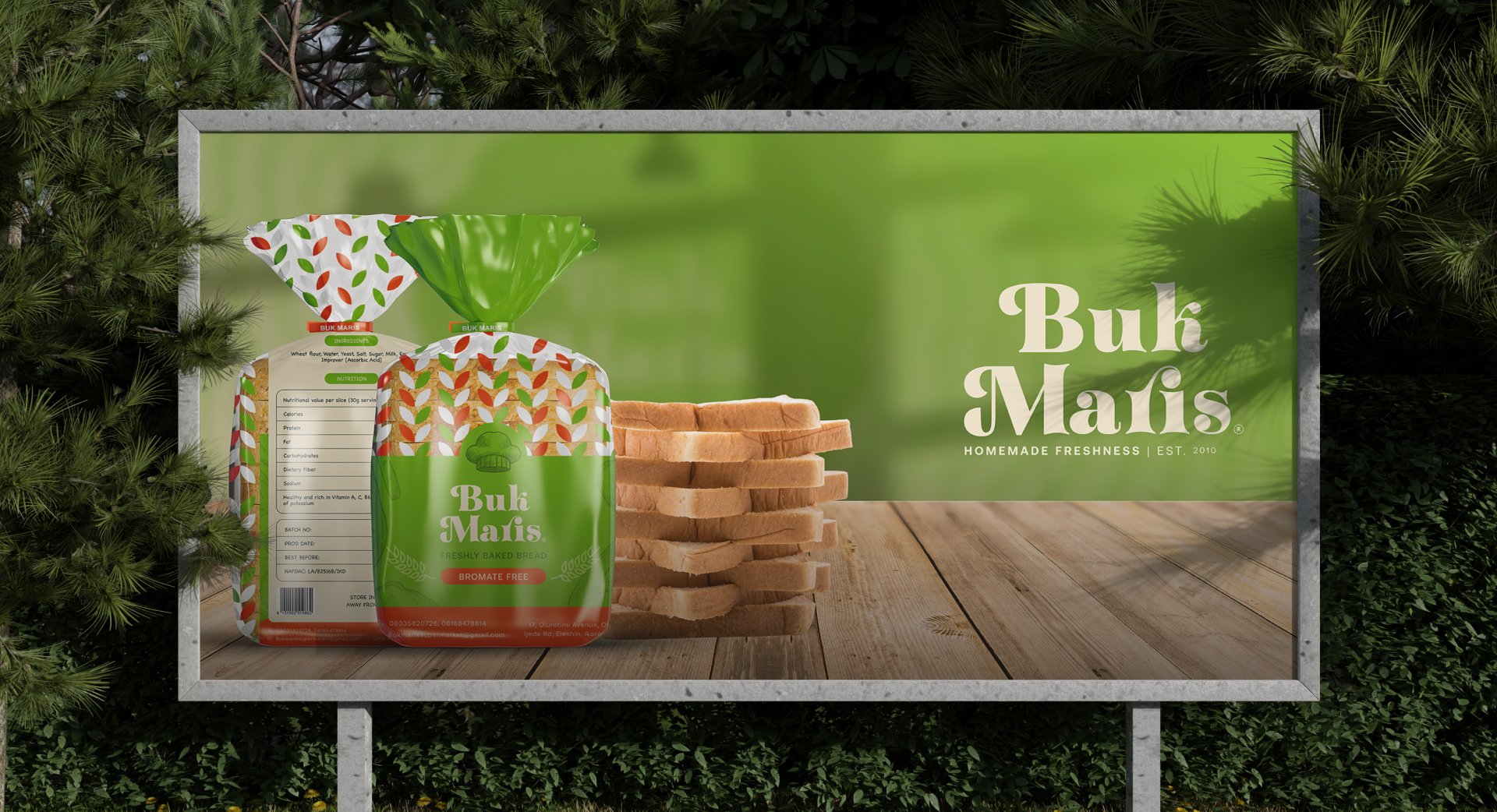
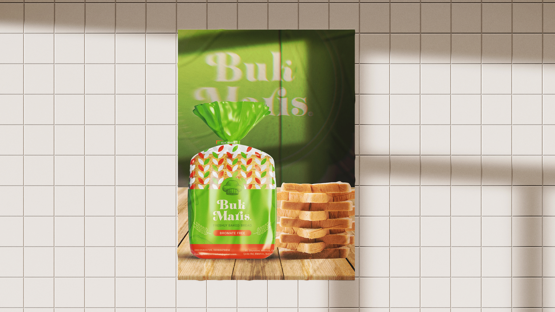
Buk Maris brings the familiarity of homemade food to freshly baked bread, plantain chips and everyday treats. The revamp gives that proposition a more consistent expression across product packaging and communications.
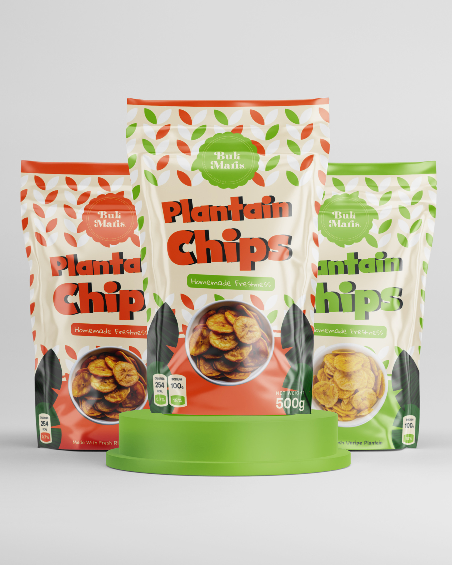
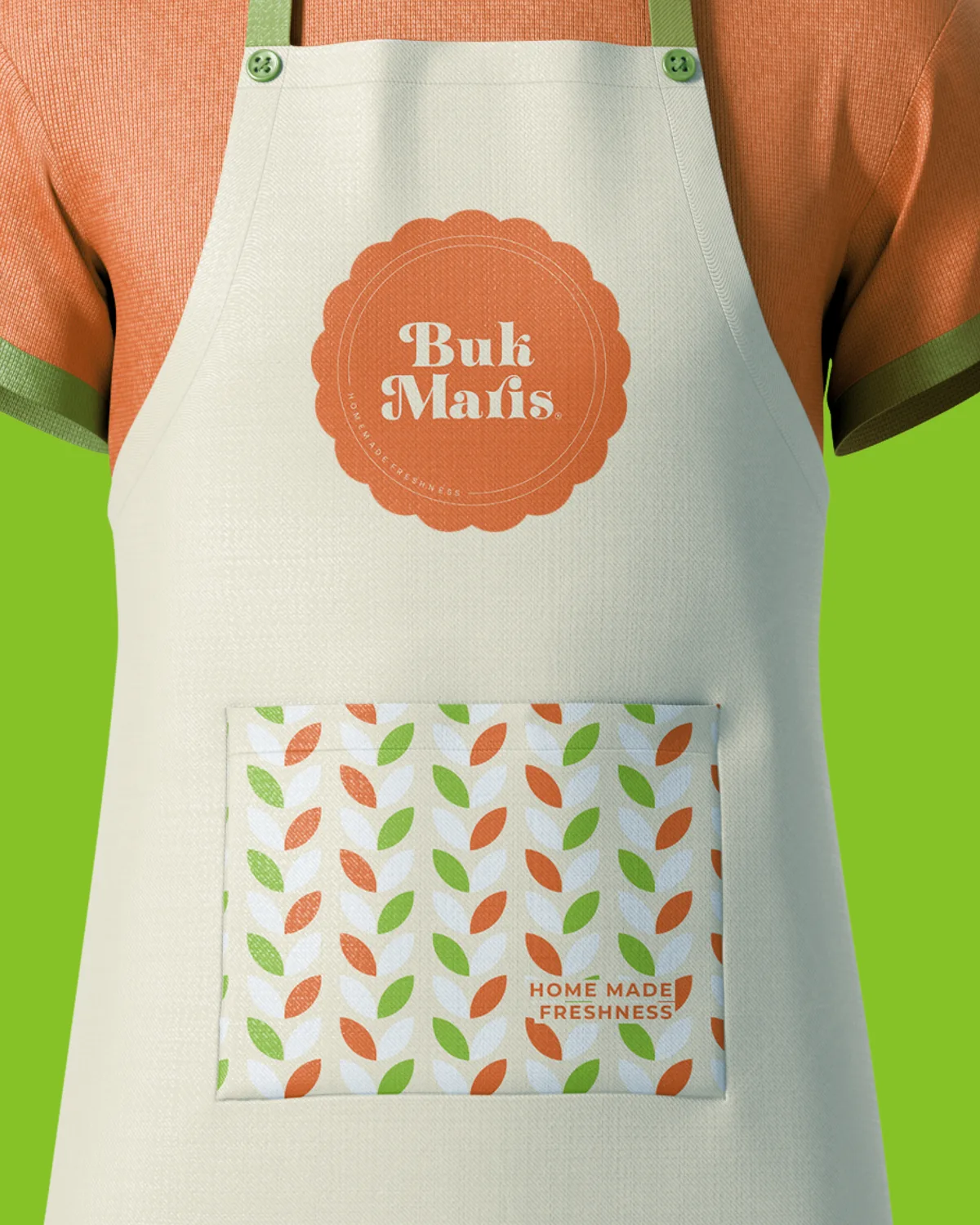
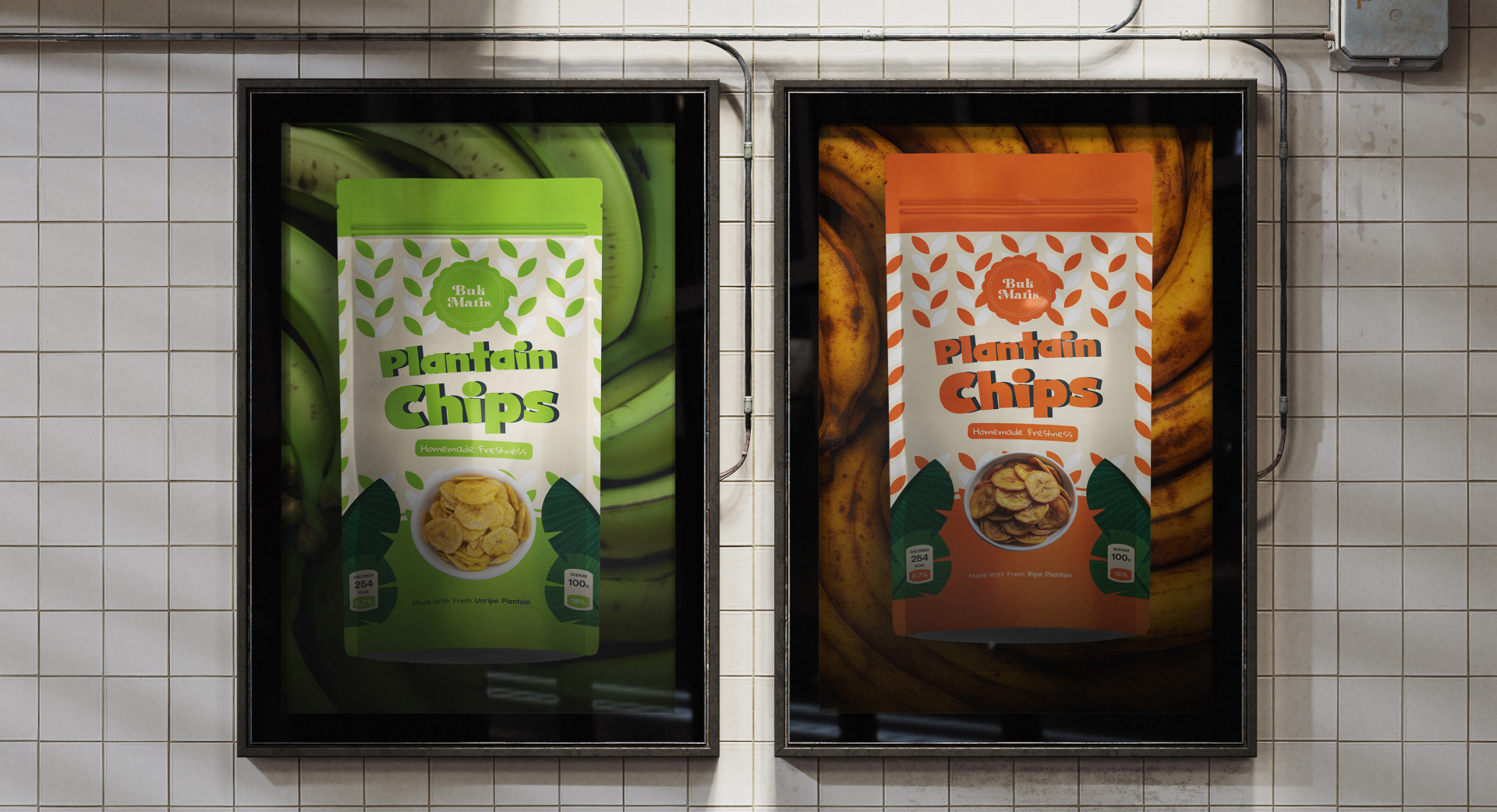
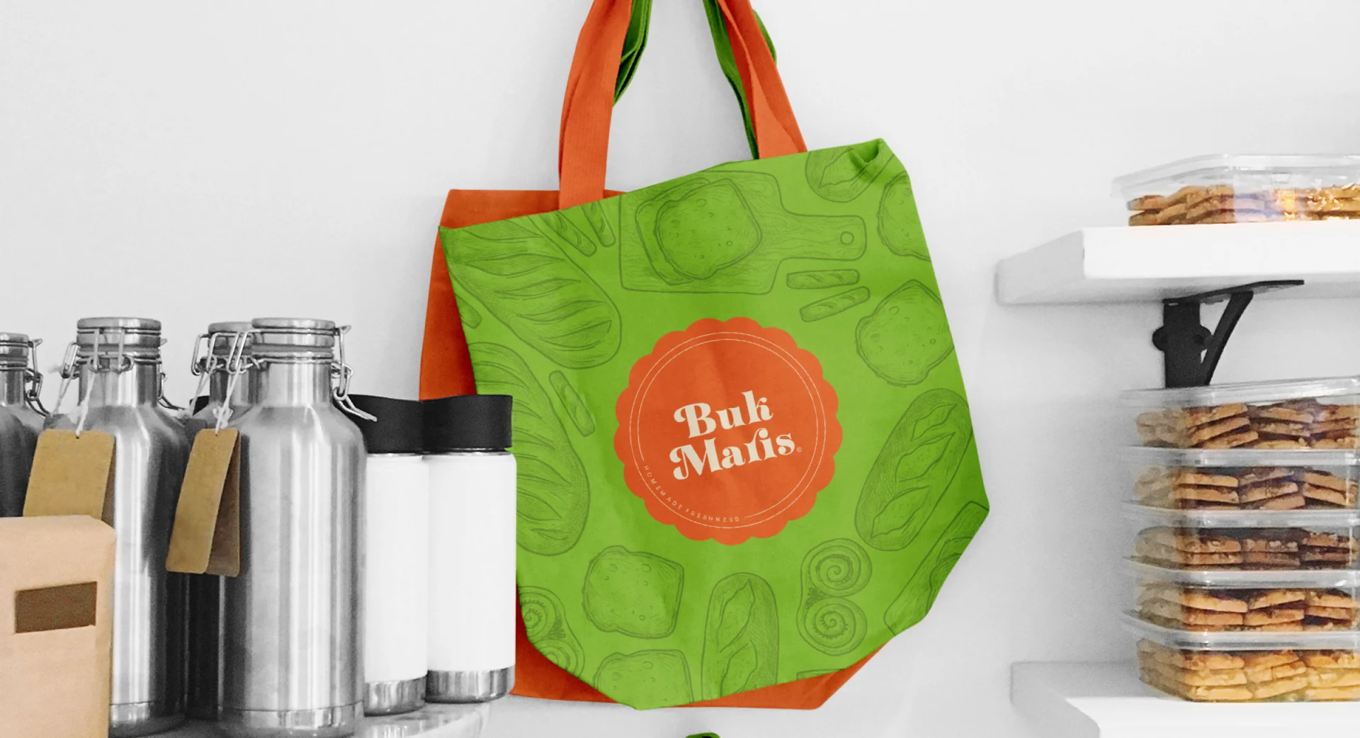
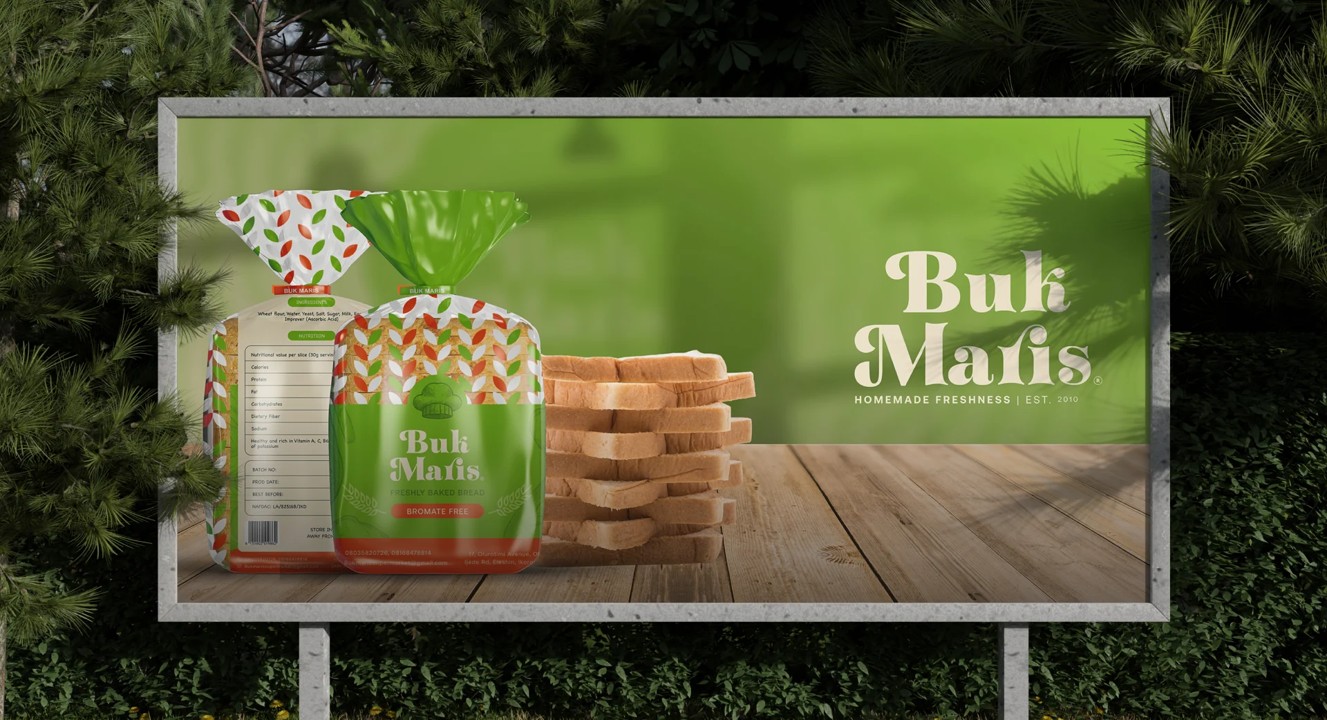
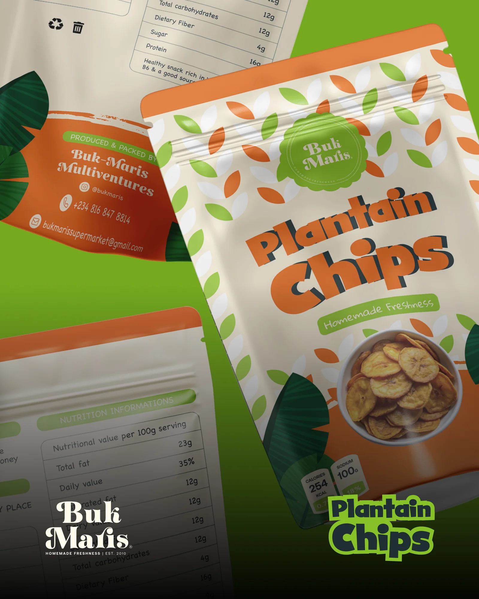
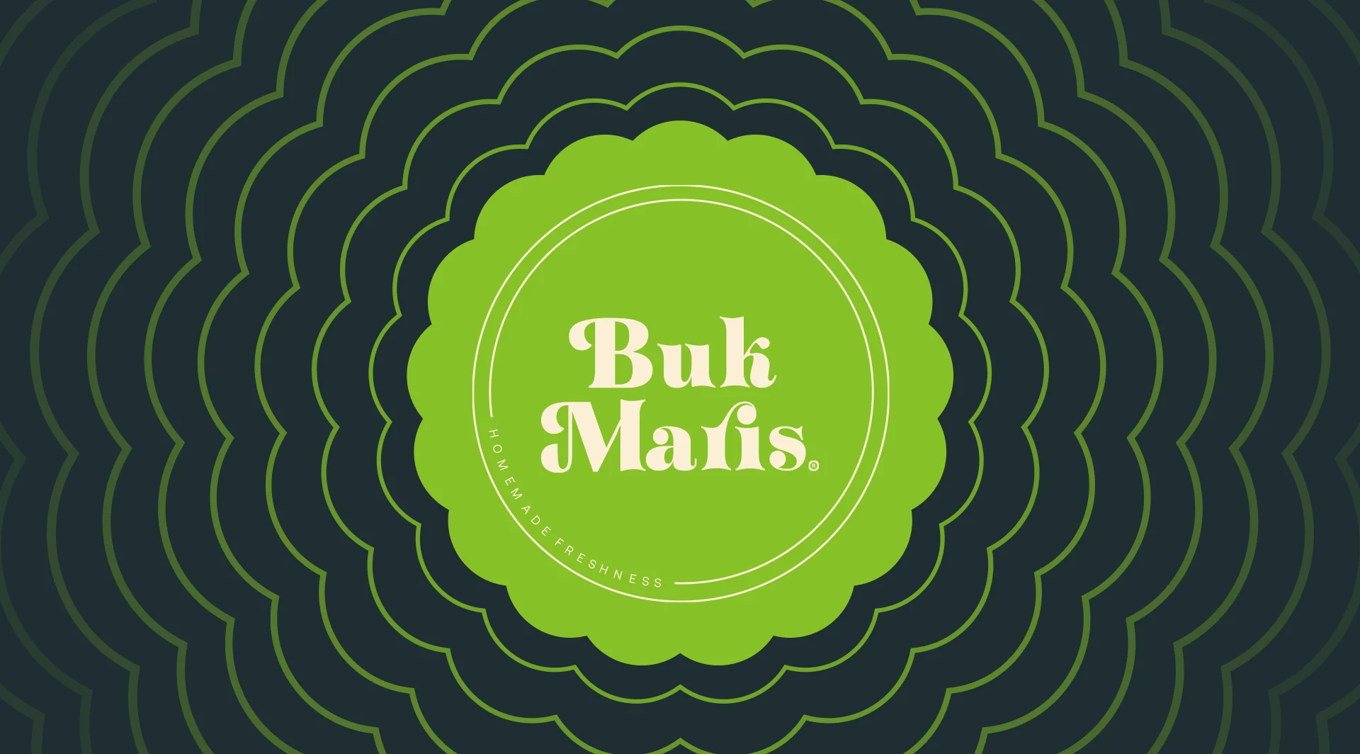
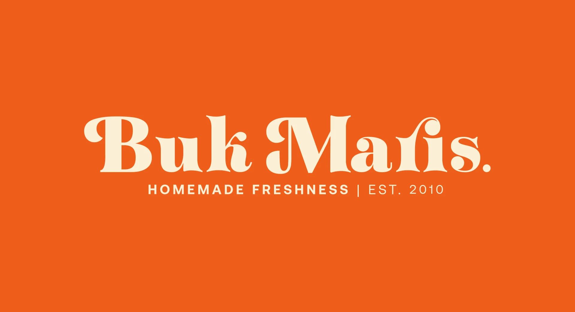
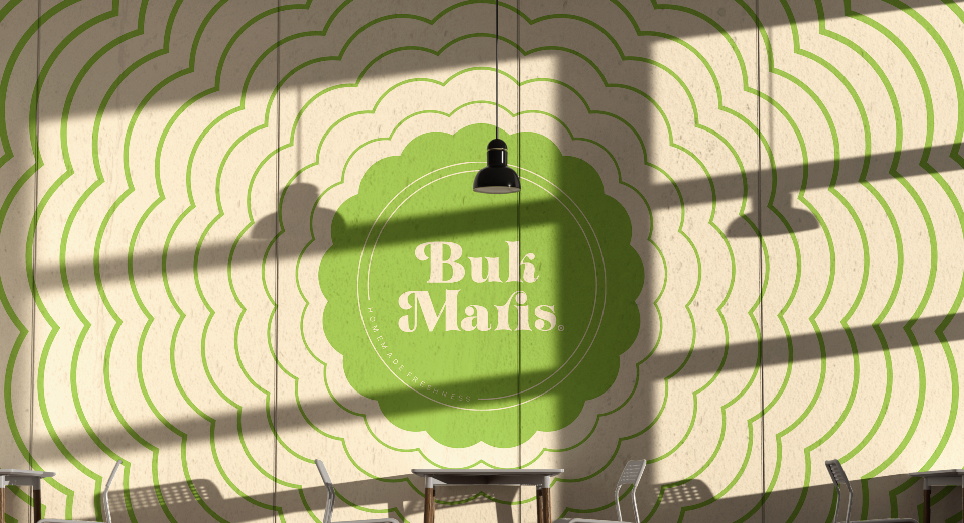
A bold display wordmark, scalloped seal and repeating leaf motif connect the range. Cream, green and orange bring warmth to the identity while allowing bread and plantain-chip products to feel part of the same family.
- Our work
- Refreshed wordmark and alternative logo, bread packaging, plantain-chip packaging, brand applications and promotional artwork.
Identity
The symbol and wordmark establish a recognisable signature for Buk Maris.
Applications
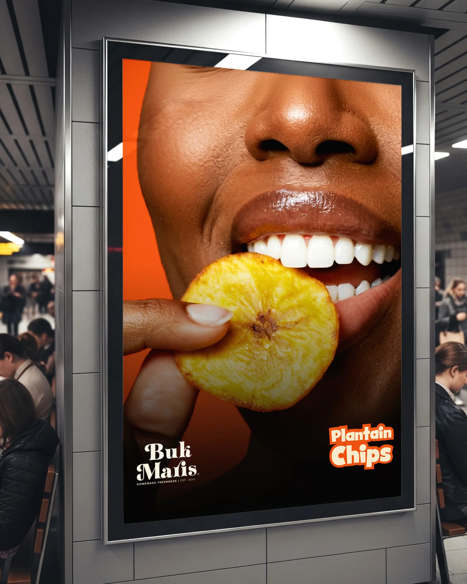
The identity extends across bread and plantain-chip packaging, merchandise and outdoor campaigns.